So, I’m pretty sure standard protocol is to begin each post-reflection talking about how difficult the semester was and apologizing for not updating as much as I should have because of said trauma. Well, why change what we all know & love?
It was especially difficult because, if you remember, I was leaving the heaven-on-earth that is Switzerland to go back into the trenches that is graduate school. I felt like I was working on a real project with a really great team and plenty of other designers to learn from and now I had to go back to school where most things were abstract. And I had to teach.
I had been secretly pretty excited to teach since I had such a positive experience TA-ing for the class last year. I don’t quite know how to describe it and I probably shouldn’t since I have to teach again next semester. Overall it was still a good experience, but I didn’t realize how emotionally draining it would be. When I wasn’t in class I was constantly thinking about the class. What I could do, what I should do, what I did, what I didn’t do, what I will do…It took up a lot of space and didn’t leave much room for me to be concerned with my own classes.
(interim critique)
I ended up dropping a class I had really looked forward to taking: Time, Motion, and Communication. It was a class where our projects were in After Effects and created animated…stories, feelings, rhythms. I just was turning in work that I was ashamed of and I knew I couldn’t put anymore time into, because I had my other classes and thesis. The dream is someday I’ll re-do the projects I already turned in. I was glad for the amount of time I did have in the class though. Dan Boyarski is a tremendous leader of students and I got to see the depth of his kindness as a person too.
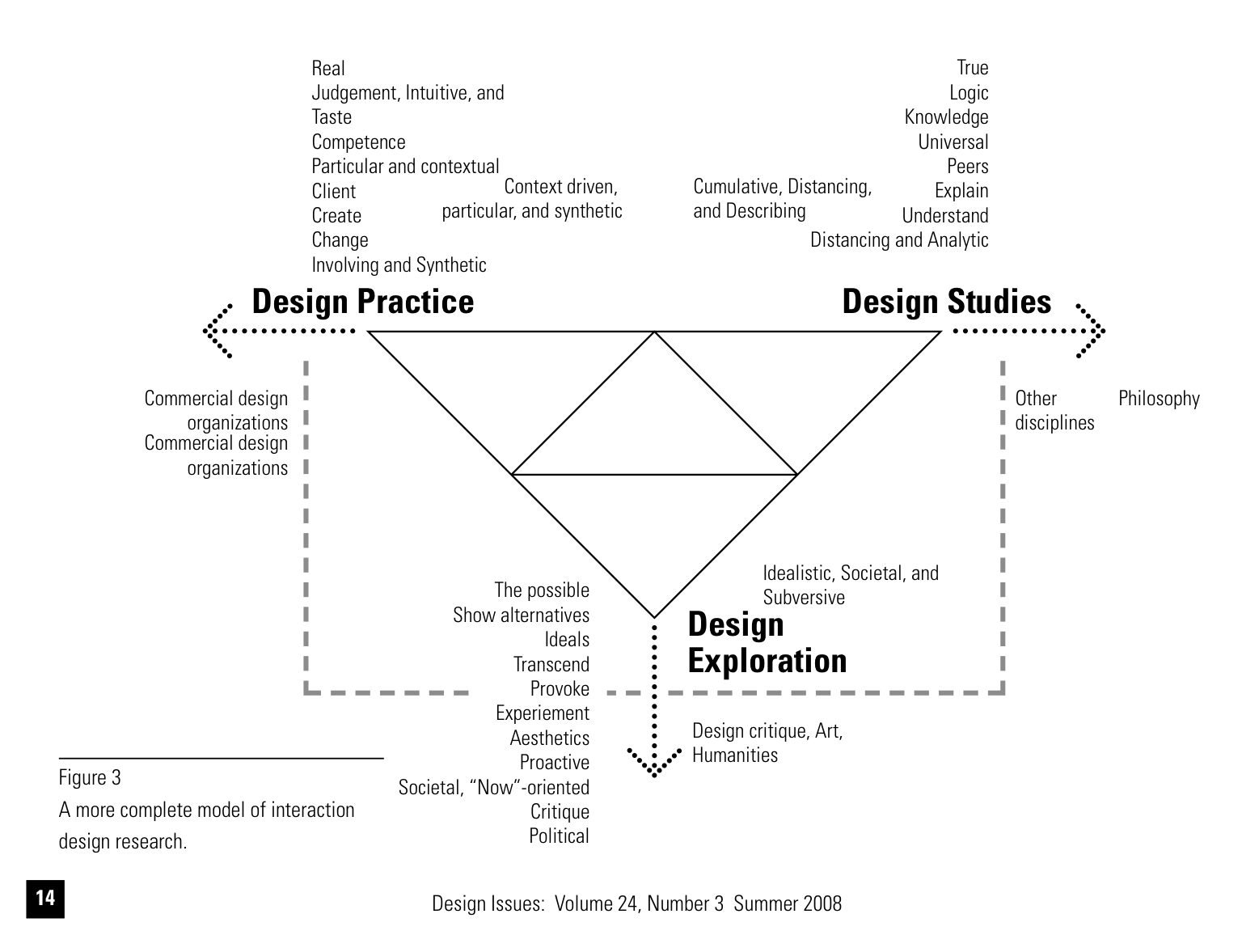
My Language & Culture class was really fun and interesting to me. I thought the repetitive format of the actual class kind of dragged on, but almost all of the readings were interesting and they settled on my brain nicely. It’s one of those moments when you’re realize with fear: I could have gone my whole life not knowing this perspective! What a scary thought. It felt a little indulgent getting to learn all this stuff not explicitly connected to design, but I ended up using the readings I did for my thesis (with questionable success, apparently).
It is admittedly hard for me to separate doing well in academia to doing well in life since I am pretty academically driven, but I would say that getting the leisure to study linguistic theory was such a pleasure for me and there is no way I can erase the way it makes me think about the world now so :P. I’ve realized recently my favorite subjects are Design, English/language, and philosophy. I could read and talk about those all day. (Although, I’m actually really bad at reading philosophy, but if you lectured at me about it all day I’d be just as happy). PLUS, since I did so much independent reading this semester, I finally think I’m better at reading dense academic articles. I don’t know why people make their ideas so unpleasant to read. I especially remember the struggle or reading these kinds of articles as an undergrad.

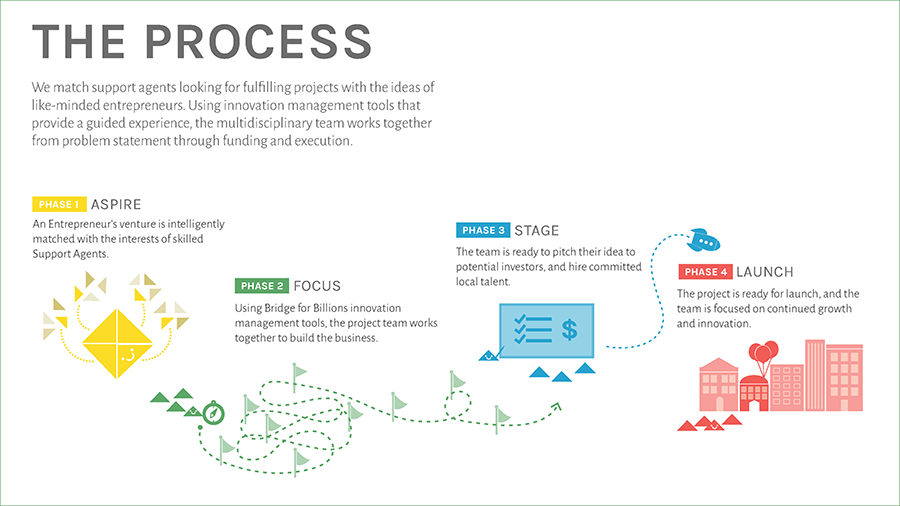
You heard a little about my independent study. It was really rewarding project to work on since they were sincerely trying to make their project happen. But again, I felt a little constrained to find the time to work on it. When I did it was really fun to dive and I felt like I learned so much just by working on it and navigating through their issues. There are some aspects about this that didn’t turn out how I would have preferred, but I’m glad I worked on it. I ended working on their service system and creating business communication pieces for them. I also offered feedback on their user experience as they tested prototypes.
 And my thesis, well, you know that happened at least. I ended up being really excited about it at the end, and still am even though the allure of sleep and my mother’s Vietnamese cooking are quite distracting. Getting feedback from other reviewers was a little discouraging. Part of it could have been my tense presentation where I decided to talk as fast as humanly possible…and part can be that people have existing ideas on design. Upward and onward, I suppose.
So. That was my review of my coursework, but school and life are obviously not the same thing. How am I feeling about design, me being a designer, etc, etc?
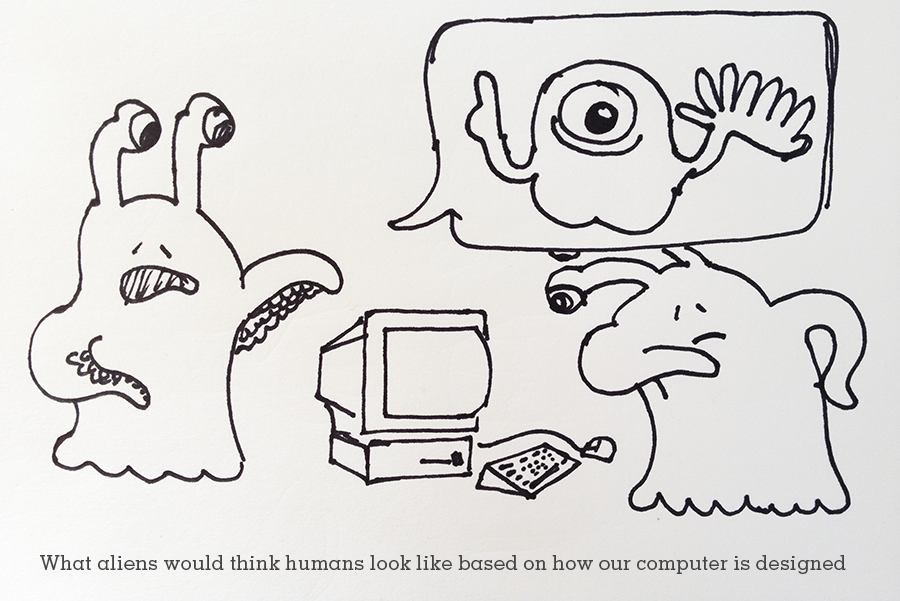
You know, I re-read my first reflection about what I wanted to get out the program and talked to my friend Igor over Thanksgiving (he is studying graphic design at Parson’s right now). He knew I was a designer and he knew, vaguely I was doing something different now. In talking to him, I realized what I was doing and was trained to do (and what I told people I do) was different than what I was used to do. It happened so slowly—creeped upon me realized—that when I suddenly looked around I saw that I learned a lot and I had these different skill sets, perspectives, and a desire to work on something else—Well, not to replace visual design, but to do something in addition to it. It was a weird and disorienting moment. When did this get away from me? Maybe during Confluence, our career fair. You tell your story so many times you start believing it. And then during your internship you realize it’s not just a story. But maybe also that you’re head is so down in graduate school and your’e trying to survive each each that you don’t get time look back and see what you’ve accomplished until you write a semester review blog post….So now I suppose I’m an interaction designer, I was hired as an interaction designer, and I like designing for interactions. But that’s not the whole story. I like getting my grubby hands on the whole user experience and design strategy, if I am being completely honest. I like doing everything from the high level thinking to comb out the tangles, to the moving and the shaking, to the painfully meticulous visual design work.
I realized that not everyone likes this whole arch of design. I realize that some people really like the planning part and really hate the execution part (some of my students, for example ;) ). But I don’t. And I really don’t like that some (not all!) interaction designers look down on graphic/visual design. It really frustrates me because so many of the designers I admire are graphic designers. They do incredible work that is thoughtful and stunning. They impact and audience and make them feel something. They can incite behavior change through a static medium in the right place at the right time. The quality and skill that it takes to do what they do shouldn’t be undercut.
All of design is hard.
It’s noble and important to think about inciting change through design at the highest level: How a town, city, government can change by design perspective. But I still believe that design represents those ideas realized. So if you have a sloppy voter registration form you’re telling people that you didn’t think it was important. That care wasn’t taken into this experience for them. You’re telling them that design isn’t important. Does that make sense? Bringing design into the sphere of public conversation and governmental concern needs to trickle down into every aspect the public touches in order to speak to its significance. Because you read into the things you interact with. Nothing is neutral. That’s how I feel, anyway.
Your favorite idealist,
Jack
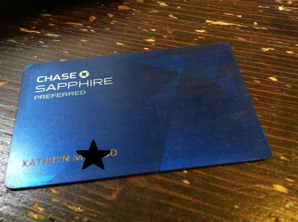 I received my new Chase Sapphire card this morning. The first thing I noticed was the weight of the card. It feels really nice. It has this matte finished and this satisfying weight. I think there is a little strip of metal inside or some other heavier material. I think it’s because all the numbers are still raised and the front is still flat. I ran my fingers over it. I had just gotten a citi card replacement the other week and it was the same flat front with all the info on the back, but the numbers were just printed on and i was worried they they would rub off or something. +1