BRO PGH // Final
OVERVIEW
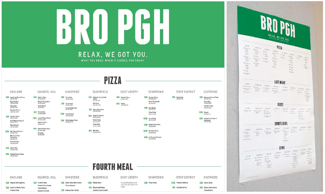
This project was meant to reinforce new skills in creating strong visual hierarchy within a large amount information. I was able to curate the information for a specific audience of my choosing. The final format was a printed poster. I chose to create a reference guide for ‘bros’ that boasted information on “what you need, when it closes, for cheap.” It displays information on pizza, late night eateries, where to buy alcohol (beer), and gyms. I imagined it as a secret weapon revealed behind the closet door of a Man Cave.
MY PROCESS
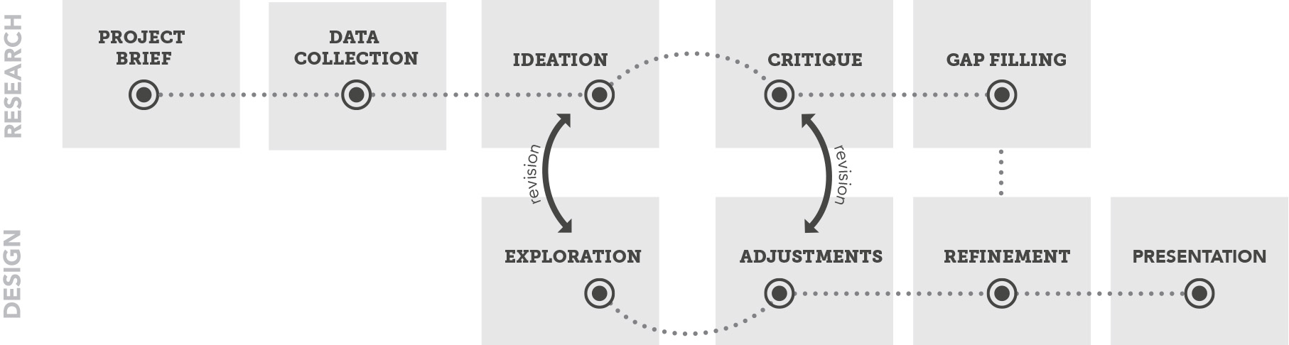
PROJECT BRIEF
Learned about the project
parameters and its end goals.
We were tasked with creating a textual diagram displaying information about Pittsburgh. Our end goal was to create a piece that allowed a specific viewer in a specific environmental context to quickly compare & contrast the different neighborhoods in Pittsburgh.
The final product would be a printed poster. Some of the constraints were that there could be no graphic elements and little to no color so that we could focus on the how typography lends itself to information organization.
DATA COLLECTION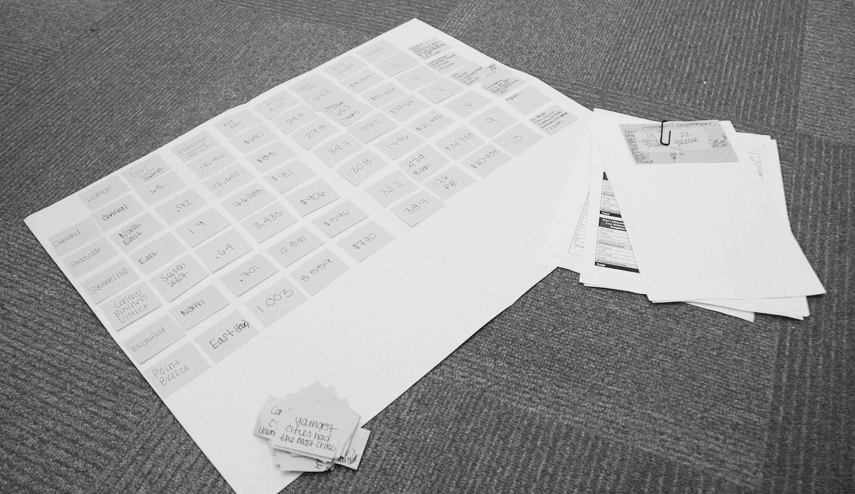
Initial collection of generic neighborhood
information and later finding gap-filling
data for the specific function of my poster.
I started with general, tourist information about Pittsburgh and then found specific information once I had nailed down my topic. The process repeats as I filled in the gaps of relevant information.
I collected data on six of the neighborhoods of Pittsburgh. Limiting it only to inexpensive places, I listed pizza places (and their phone numbers, of course), liquor stores, late-night eateries, and gyms. All of these categories was listed in order of open-latest. What more could a bro ask for?
IDEATION
 Explored different topics to find one
that fulfills the goals of the project and that
I would enjoy working on.
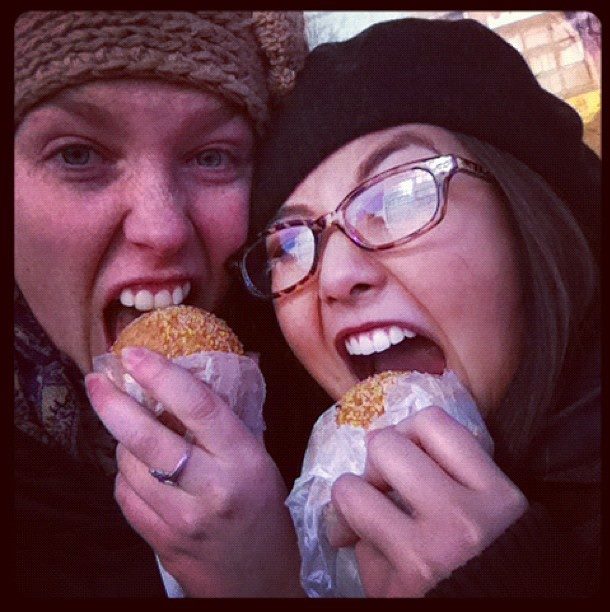
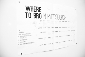
My final inspiration came from Pittsburgh Pirates’ game I went to the previous weekend (my first!). It was outside my comfort zone and I found myself thinking about the audience of the game. I decided to create diagram that would be found in a frat house/bachelor pad: Places to “bro” in Pittsburgh. This clear audience lead my final content, context, and design. In addition to helping direct the content of the poster, I appreciated that this audience would force me to think outside myself. I love experimenting in design and was glad to create this opportunity.
This can be the hardest part of a project. I ended up nixing my first idea because it wasn’t supporting the goal of the assignment: to compare and contrast the neighborhoods easily through designing information.
 DESIGN EXPLORATION
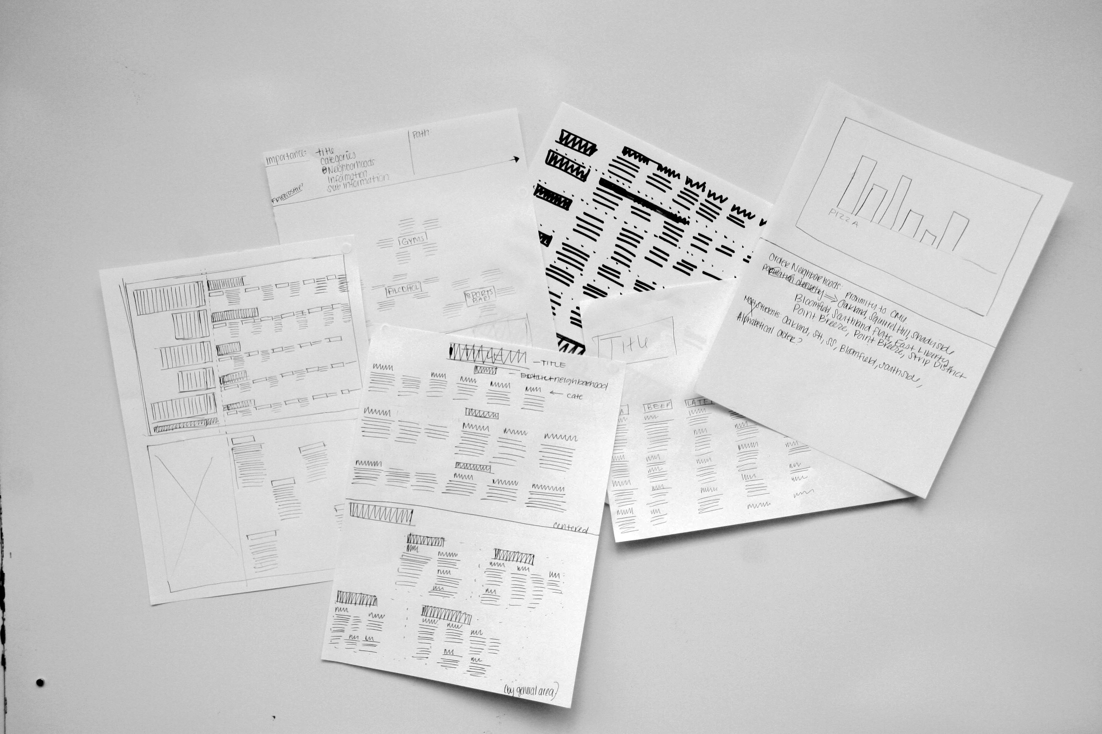
Reviewed how all my information would
look on the screen, tested different grids for
organizing content, and new methods for
creating hierarchy that was both clear and
visually interesting.
I had a vision of how I thought I wanted the poster to look, but once I got all the information on the poster, I realized it wasn’t going to work for many reasons. In the end, I decided that each of the neighborhoods and the categories had to line up (versus stacked or be random locations on the poster) in order to make the comparisons clear. I re-focused on layouts that make this with this lesson in mind.

CRITIQUE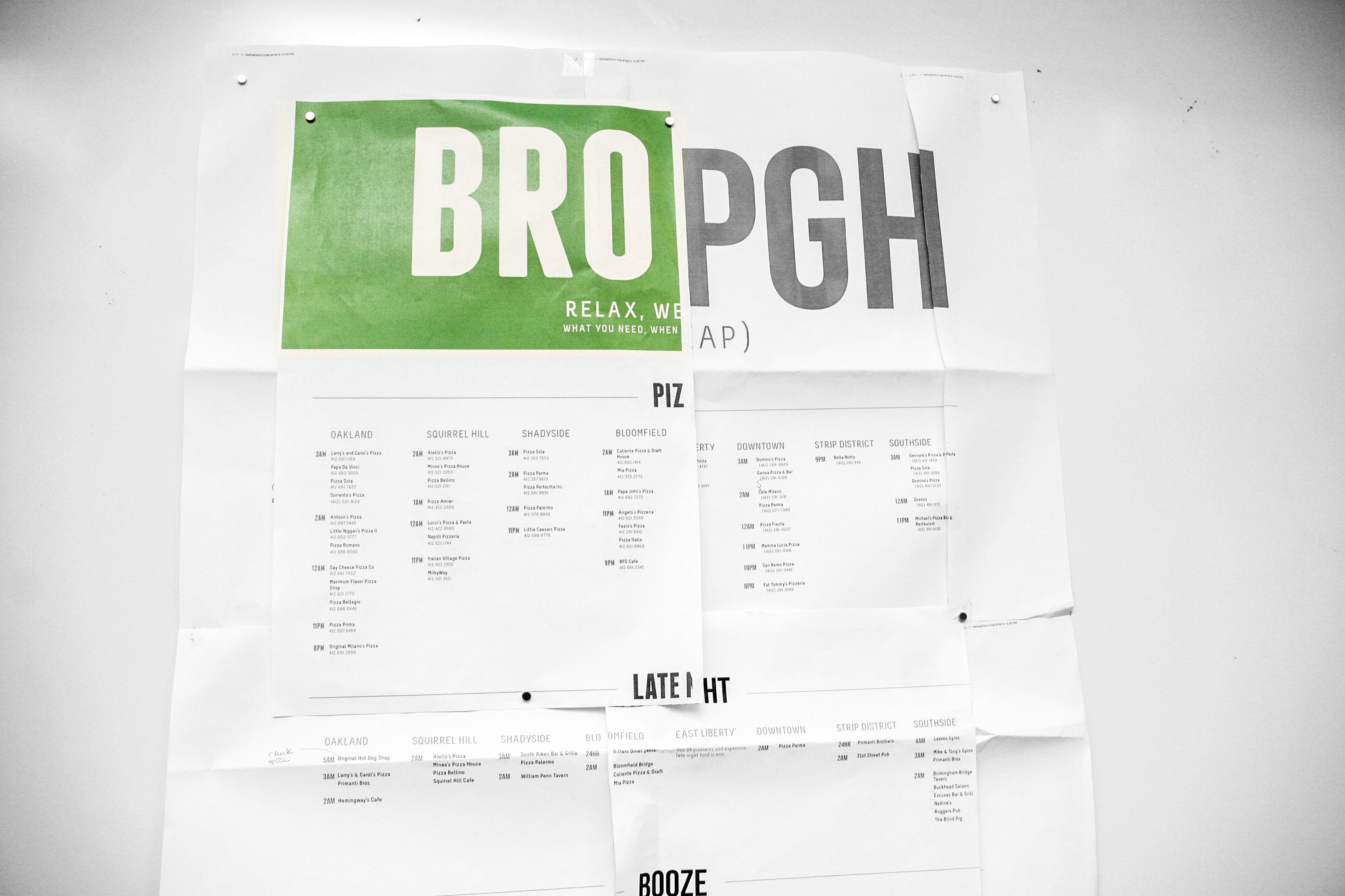
Showed drafts of my project for my peers to review.
It was a chance to get a different perspective on
what is and isn’t working, and why.
In order to be most useful to the user, I arranged the specific businesses in order of what was open latest. That way, bros looking for a place to eat on a whim after an after-school GTA marathon can quickly find what’s open (when you go out during the day, it’s a given that places will be open.) My peers said the time was the most interesting and approachable part of the poster so I made this tidbit stand out.
Since this was something hanging in a home, the text size could be more intimate, readable at a distance of about 1-2 feet.
REFINEMENTS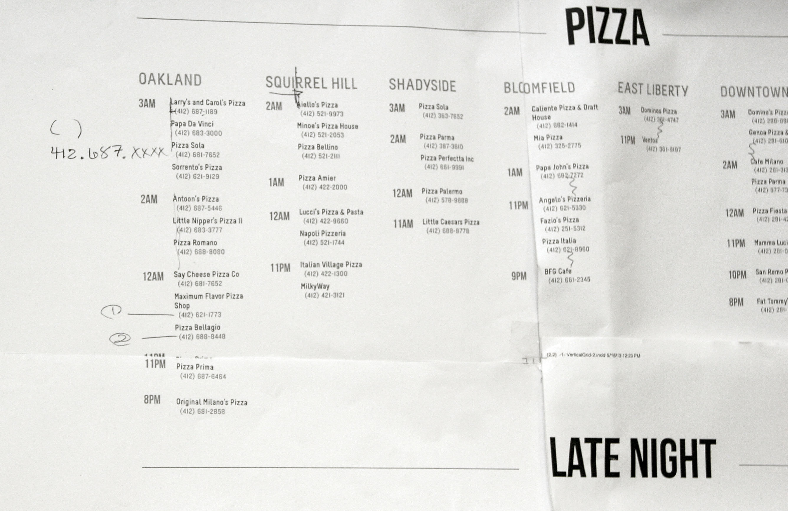
Fine-tuned an effective solution to
make my content clear and enjoyable
to read.
An example of last-minute tweaking, one of the last things I worked on was making sure the title, “BRO PGH,” was the right size in proportion to the rest of the content and size of the poster. I ended up shrinking it a lot right before print because I felt like its original size was overwhelming and overshadowed the content too much.
Once the general layout was established, I went through my poster with a fine-toothed comb, making sure the spacing and font sizes are the same, that chunks of information are properly distinguished, and elements were the right proportions.
FINAL PRESENTATION
Time’s up!
I was happy with how it turned out and I had new appreciation of how to establish hierarchy and comparisons through type alone. It gave me the opportunity to really engage with my content as I made order from the chaos.
On future revision of this project, I might explore how or if it would be appropriate to integrate more graphical elements into the piece now that I have a framework.