Part II: My proposed project
Another pointless writing exercise.
So when we left off last time I was discussing my circuitous path towards my resolution before I had to disappear to class. I had left you all with the oh-so intriguing argument that we should not get caught up in what approach to take when approaching design, but in how facilitate as creative perspectives in general. An idea, of course, that is not actually new, if you didn’t catch my facetiousness.
My idea was to create a wiki where designers create entries describing tools for interaction design. These entries would attempt to break down all of the elements that designers have at their disposal in order to create interactions. I created these categories by thinking about how things are sensed (vision, sound, touch, etc.) and explored additional context information, like location compared to other people. Within vision, some examples of the smaller elements I described are the ones we’re most familiar with like type, color, lines, spacing—The basic elements of design that we all learn in school. Then we can break it down into how those specific elements are used. These are old hat for any designer: how different typefaces create different tones, how angles in a composition can create more energy. But when we do the same exercise with something like sound or haptic feedback we intearction designers don’t have as clear of guidelines for using these non-visual elements. Instead, often sound and touch (e.g. vibration) are used as a last resort for designers to intrude on the user rather than enhance their experiences (an alarm clock or event reminder). Musicians and sound engineers might be more familiar with how to treat sound in a way that better blends into our lives or even making the sound we experience now more appealing. For instance, based on the knowledge that, in our culture, they might use discordant sounds to indicate an error or high sounds as a happier event in order to create a more sound-rich experience. It might hard to imagine now how all sound feedback could integrate into our lives without being obtrusive, but that’s because we’re not used to our technology emitting it. However, away from screens it seems perfectly natural for the devices we use to make sounds that we don’t notice. We’re used to car engine making noise, it tells us it’s working find and we get used to hearing the specific sound it makes. When electric cars came out, their much quieter engines became a hazard for pedestrians and bicyclist because they couldn’t hear the vehicle coming. I know that I can recognize the very soft hum of my external harddrive turning on and listen for it to stop to make doubly-sure that I can safely unplug the device from my computer. The future of interaction design might already be out there, it’s just not widely spread. Yet.
The initial categories I had were:
- Visual
- Auditory
- Haptic
- Social
I know taste and smell are missing. Perhaps I’m being closed-minded, but I personally didn’t want to explore them at this time. Anyone who wanted to contribute to the wiki is most welcome to explore the possibilities of those two senses.
And I evaluated these elements by how they can function to accomplish one or a combination of the following for users in design by creating rhetorical categories. These are initial categories I created and, again, I hope that other contributors bring their own perspectives to the project.
- Informational
- Orientational
- Feedback
- Metaphorical
- Performative
It is my hope that this exercise in creating and editing wiki entries on the design elements would help designers break away from the same patterns they use to create interactions and see other elements at their disposal through the process of creating entries or viewing them.
I think it would be helpful to go into my working definitions for each category as I worked in them. By default, it’s easiest for me to describe these interactions as constrained digitally to screens, but I know that interaction design can appear in the real work beyond devices and try to give examples along those lines too.
Visual
Elements that can be perceived by the eyes. I think one of our first reactions is to consider visual things as the aesthetic components of design (color, typography, and position), but of course it’s also all of the content as well. Even the content of a digital page is something that a visually impaired person wouldn’t even be able to benefit from like a sighted person can. Even without reading the content, a glance can give us a sense of how much content is on a page, navigation cues, and perhaps set our expectations for the professionalism—and therefore trustworthiness—of a website. Consider also that feedback is often given as a visual cue of color (red=this is important and required).
Auditory
Auditory elements are qualities of design that can be heard. Reflecting on all the possibilities of described in our visual perception might help you see the disparity that exists for audio richness in the majority of our devices. How could the qualities of sound lead you through a design experience as much as typography adds style and beauty. Sounds are most often used as an alert, but what if they were used more thoughtfully in other areas. For instance, screen readers do things like indicate when a link has been pressed, the screen loading, and when a page has completed loading. They often list all the of the headings or navigation links in order to be more helpful and this can sometimes serve to show how big or small a website is. I’m curious to see how to make more beautiful and dynamic experiences through auditory design.
Haptic
Elements that are sensed by touch. For instance, our phones vibrating when someone calls. However, again I’m more curious about how sound can be used to enhance our experiences rather than get our attention. Like rumble game controllers that vibrate when we’ve been hit. This is feedback to get us to be more engaged in the experience and make the screen reality more present.
I recently came across research on ultra sound that lets people feel 3d, invisible objects. Then I worked backwards and thought about when someone might use it. It reminded me of relationship apps that attempt to make you feel physically closer to your partner. For instance, TouchRoom shows where your partner’s finger is on their screen and, if you put your finger there too (on your respective screen), the phone will vibrate, and Avocado lets you do something similar with “hugs.” It’s supposed to be this cutesy moment of like, looking at the moon at the same time for long-distancing millennial. Maybe people will want to send each other something that feels like full hugs, instead of just a phone vibrating against your chest. Or have a friendlier version of the electric fence for dogs (just something that feels like a barrier). Maybe this would be possible with the ultrasound technology.
Outside of digital experiences, there are of course the physical qualities of objects that we can respond to by touch. The single button on an iPhone has a depression which is helpful for blind users. We also often have connotations to the weight and texture of an object: we want our devices to have a certain heaviness in our hands because we associate it with durableness. (But we also want it to be light in our backpacks).
Social
I defined social elements as ones that showed context and acknowledge the user and the world inhabited by other users. This could be basic things like indication of location compared to different people or places, to explicitly social activities like chatting with other people where there are “statuses” of online, offline, busy, etc, and indication whether that have or haven’t read your message (I use the term “presence” for these chat-related indications). These change the relationship between participants in an attempt to make people who are far apart have the same kind of feedback as people physically close to each other.
—
Form
While I was making this post I also thought of another category of the actual physical device itself. The setting for the screens and how that can influence the interaction. My professor was telling me about the ipod’s click wheel and how it was designed for a certain function to solve a certain problem and that’s why it was go great. After the invention of the click wheel there was a huge trend in creating objects with click wheels even when it it didn’t make sense and fill the same need. He told me his friend was told to make a click wheel on a microwave. I’m tentatively proposing the “form” for as the name for this category. The form of the object that may or may not include the interaction device. It can include features like size, curves, angles, material, texture. This is related to haptic feedback in that part of its qualities are felt, but there are qualities about the form that are seen, weighed, or merely have cultural associations.
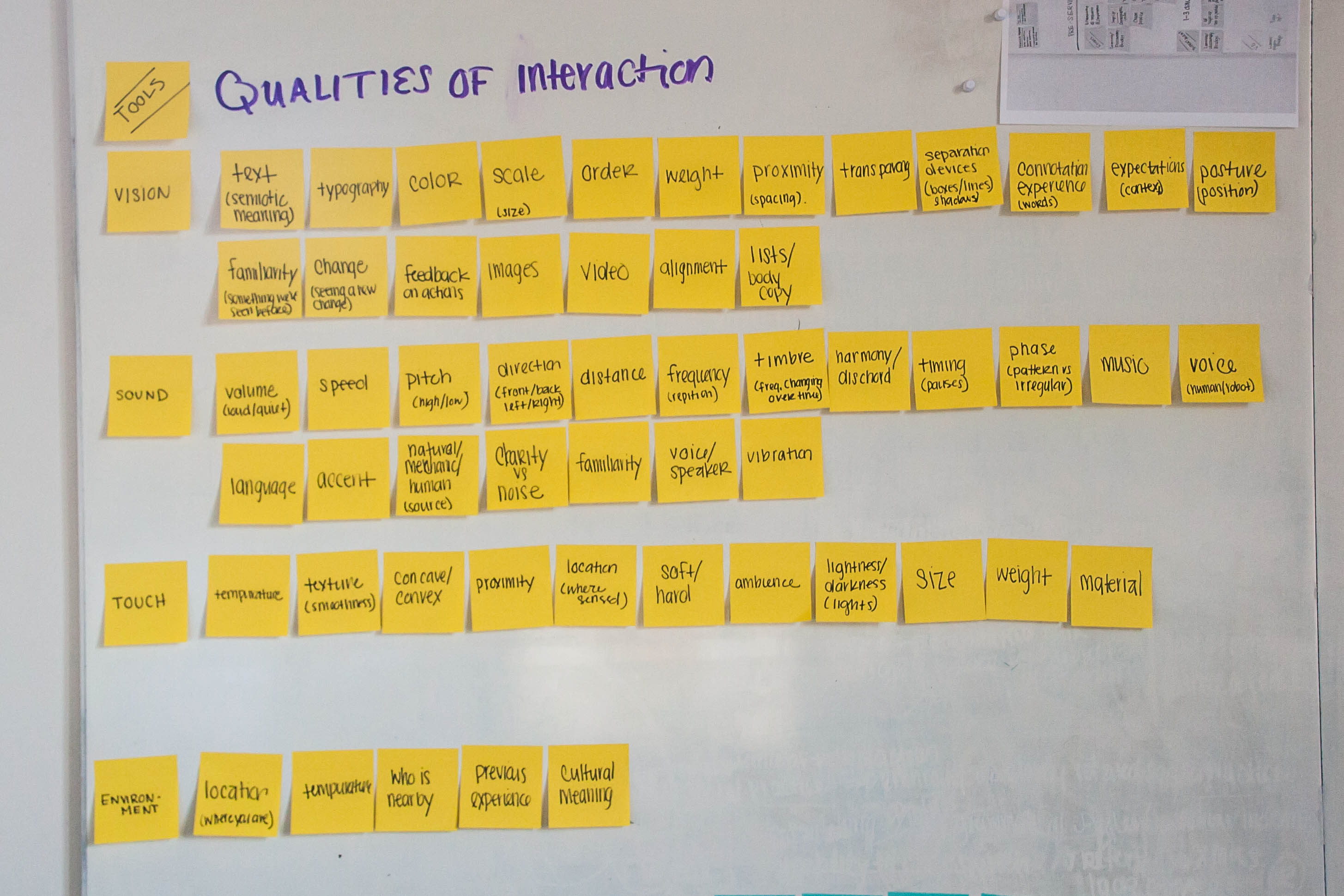
post-it note exercise I completed early on
After giving examples for elements for each sense, I looked at how they do or could function in interaction design by creating new categories. These were based off my interested in rhetoric (as I wrote about last time), but I believe that someone else could create different categories that reflected their own philosophies. Of course, I also quickly realized that the elements did not fall into any one single category and often had instances when they straddled multiple categories:
Informational
At the basic level, this type of information is the content of a design. More functional than stylistic, but, as Kinross would confirm, all content assumes some level of design as well: what’s selected to showcase, how it’s organized…As I’m writing this, I’ve decided to get rid of my stylistic/decorative category because I can’t imagine in what way an element is void of stylist qualities (which inform users about the experience). Although, there are definitely different degrees to which someone has intended content to be perceived as neutral versus stylistic. A frequent example is when brands use colloquial language. But even the addition of an icon instead of a text label communicates differently to different people.
Orientational
Elements with give directional information to the user. These could be indications of what the user should and shouldn’t do, where they should go, creates categories of information (think navigation bar), and also typically creates groups of information. Like wayfinding systems in buildings, this could be arrows on a device which indicate which way to advance photo slideshow. Or it could be more abstract like the way that different content heading styles group information. For instance, the heading on a page tell us what the most important topic it is and which content supports it through hierarchy. In typography, this is often created through scale, weight, color, and font. In games, sound might also be given to tell us that we’ve made a good or bad decision.
Feedback
Feedback is used to acknowledge interaction or performance by the use. In the book Microinteractions, Saffer explains that on interfaces feedback shows when something happened, you made something happen, something has started/ended/is ongoing, or that you cannot perform a function. The loading/progress bar is a familiar example. An example in the natural world might be a stooped plant with dried leaves that is providing feedback that you might need to water it.
Metaphorical
I considered metaphorical elements those that stand-in for representations in the physical world or those that reflect our culture’s metaphorical construction of the world. The first part is easy enough to understand, we create a smartphone icon that looks like a phone in order to tell people it’s a phone, even though our smartphone itself doesn’t look anything like it. In microinteractions, we pay close attention to transitions in order to create naturalistic significance to the changes on our screen. Apple uses the genie effect to show things rising and shrinking from the task bar. Our computers allow us to ‘drag and drop’ files into different locations.For most people, this is our mental understanding of how to move files on a computer when really, its a designed experience for our benefit (really the computer is re-writing the lines of code to save the new location).
The second part ties into this, the metaphors our culture creates that reflect our understanding of the world. One way this can manifest instead is through language. For example, seeing time as a commodity: something we can owe another person, give another person, we can spend time, something can cost us an hour, we can budget our time, and loose time (Lakoff & Johnson, 1980). Or up is good, down is bad (“the economy is on its way up!” vs “the economy has hit rock bottom”). In the same ways design can reflect these metaphors. In physical ways we might see electronics showcase the idea of “bigger is better” (or challenge that). And our interface, moving to right usually indicates the next item. That’s why I get momentarily confused when I’m at the bottom of blogs when it says “previous/next”: In other aspects of my life, “next” means the newer things and “previous” means older things, but because blogs are formatted in reverse chronological order, previous means indicates newer entries (that you’ve already seen) and in next indicates older entries (which you did not see first by default).
Performative
The performative category I created is based on the linguistic studies I did this year, especially JL Austin, Goeff, and Bordieu. These are instances where illocutionary action or feedback is provided that leads to actions, emotions, or is otherwise persuasive. These types of interactions “make” an audience do something within a social context. For instance, the text on a website might have a specific stylistic voice, reflecting traditional rhetoric where a personality and expectations of the brand influence a user. An example of interaction I give to represent this is that a text box might resize to become larger when you click on it and when you write. This re-sizing would encourages you to write more (or indicates that it’s ‘ok’ to write more) just like standing up at a dinner table indicates that you’re ready to leave. On the other side, if type and the text box does not grow and instead you’re content is disappearing off the left side the more you type…you might be discouraged from writing more.
The second part of the website will be a gallery where participants can share their own ideas for interactions that don’t exist yet, have been prototyped, or are on the fringe of use. It is my intention that these entries will be curated by the community as more meaningful interactions that showcase the spirit of ‘broadening our palette of interactions’ and aren’t interactions that serve an over-saturated market. I would encourage people to contribute to categories such as: social, environmental, and accessibility (in addition to more functional categories like technology types). The wiki provided a hands-out space for designers to participate in a shared reflection of the profession whereas the gallery might be a more immediately inviting space for designers to become inspired by the possibilities of interactions by seeing how the discoveries in the wiki have played out into a full fledged idea in the gallery. The gallery could include video sketches, prototypes, and static sketches of people’s ideas. I hope to allow for comments from the community on projects to critique and encourage the poster.
 My intention is that both over an opportunity for designers to participate in their profession in whatever way they are more comfortable. The format is one that can help both seasoned professionals and those just entering the field. People with more design experience may be more inclined to actually contribute to the wiki or the gallery with their own ideas. Whereas a new student to design might be more inclined to wander, read, and see examples that professionals before them have seen.
The online format of the editable wiki allows people to cross link and share examples. Hopefully designers are just as engaged by jumping from entry to entry as some people are to exploring wikipedia articles as one interaction leads them to the next.
To be clear, I’m not really interested in creating the definitive document for interaction design, rather in creating the space and opportunity for designers to explore different interactions and this was a format that I personally found really interesting.
—
Implications:
 Even though interface design has been worked on for a few decades now, it is still in its infancy when we compare it to the history of all man-made objects. There is so much to explore and discover as technology develops or, more optimistically: as we push technology to support us in the interactions that we need most. There is no reason for us to let large companies drive the patterns we have for our devices or even the shape they take. Just as Apple re-envisioned the shape of the smart phone with the original iPhone. Or even in smaller ways with how Android re-designed their alarm clock system to more closely map to how we actually interact with time (it resembles a clock). We can rethink our patterns of interaction and broaden how we imagine our devices to work for and with us. How can our devices support what we want to do instead of telling us what they can do? As we have greater demands for our devices to be more spontaneously life like, how can we support this through interactions on a system level. This change might lead to a re-thinking of how the entire product or service is considered.
For me, there seems like there is a tremendous opportunity to explore other modes of interaction—like sound and touch—to be as robust as our visual experiences. I do consider vision one of our primary senses for interaction design professions, so I don’t want to criticize that it’s the way we get so much information from our devices. But I also know that, according to the World Health Organization, “285 million people are estimated to be visually impaired worldwide: 39 million are blind and 246 have low vision.” I’m interested in helping designers create as vivid of experiences on devices as sighted individuals have.
Exploring richness in non-visual ways is an opportunity to expand the tools we have for creating interactions, perhaps device-less interactions. For example, we’re currently exploring wearable technology we had a very small or no screen at all. More of its potential might be able to be unleashed if we could invest in making it as communicative as our other devices.