Chase Sapphire card activation as service design experience
I’ve been taking Designing for Service this year so I feel like I’ve been hyper-aware of certain service actions and how it compliments design and encountered one this morning.
1.
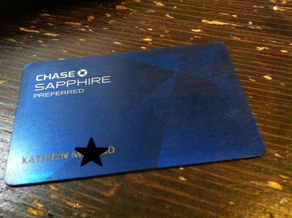 I received my new Chase Sapphire card this morning. The first thing I noticed was the weight of the card. It feels really nice. It has this matte finished and this satisfying weight. I think there is a little strip of metal inside or some other heavier material. I think it’s because all the numbers are still raised and the front is still flat. I ran my fingers over it. I had just gotten a citi card replacement the other week and it was the same flat front with all the info on the back, but the numbers were just printed on and i was worried they they would rub off or something. +1
2.
And I also noticed that they make you call and talk to someone in order to activate it. To a real person. Who is supposed to go over some of the benefits of the card. This was really surprising to me because I feel like usually you just call a number and type in a code and your card gets activated. I was surprised they were willing to spend the time having this point of human touch. Maybe that’s where that &95 annual fee goes. It became an opportunity for them to emphasize the good points and for me to ask questions if I needed to instead of (a) writing them an email later, which I would do instead of calling or (b) just not ask (more likely) and get mad at them later for penalizing me for something I was unaware of. It was helpful for him to highlight verbally 3 of the short benefits/stipulations of the card, even if they were in the paperwork too. +1
3.
I did want to ask something though. You get 40,000 travel points when you spend $3,000 in the first three months. I wanted to know what the 3-months mean: calendar or 90 days. They said 90 days that would start from when you were approved. Which was seven days before I got the card and activated it. That didn’t seem fair. I asked I could have those seven days back since I couldn’t actually use the card. He said he get’s that question all the time but that he could’t because he had to be fair to all the customers and have the same amount of time for everyone.
Getting a question all the time tells me that a service is not meeting expectation or there has been poor communication, or both. Of course we all excepted that three months to start when we can actually use the card! I think their solution was to be a little bit unfair to everyone. It’s not that I can’t spend the month, but now it’s like I feel I’ve been cheated a little. Like the company has fine-printed me. -1. (emotionally, it’s a -2).
— —
Anyway, I wanted to write about it because how very conscious I was that I evaluated the experience from start to finish as service design. Like, when I was holding that card in my hand I was thinking “this is a great-feeling card. This is what someone wants to feel when they have a card in their hands. It feels sturdy and impressive.” The visual design is sleek and subdued. And the industrial design is pretty neat too.