Why rhetoric?
A writing exercise of little importance.
During my thesis review one of the advisors and I got into a back-and-forth discussion about whether rhetoric was the correct way we (designers) should thinking about and approaching design. He believed it should not, I believed it should. He believes in working with the “direct perception” or “embodied knowledge” JJ Gibson describes in his work on ecological perception (designers, you know, affordances) as you approach your designs. I also think we should.
I spent winter break balancing both philosophies in my mind. I can appreciate using rhetorical analysis as a tool to approach design and learn/discuss how it does work on people. I initially chose to use literally theory to approach design for vague, personal reasons. I have cherished how much my English background influences how I think about problems, people, communication, and design….the world really. I say it’s vague because I don’t know the specific way to apply what I felt I got from four years of English coursework into design.
What I ended up ultimately doing for my thesis, I used different linguistic and rhetorical theories as a framework to analyze different elements of interaction design. How is our actions on device metaphorical? What kind of persuasive communication techniques might they be applying? How are they stylistic and what does that do to create identity? It ended up being an exercise in thinking critically about what design elements do and broadened the way that I thought these elements (or others) could be used. Whether it be visual, auditory, haptic, or whatever other kind of information that can be sensed.
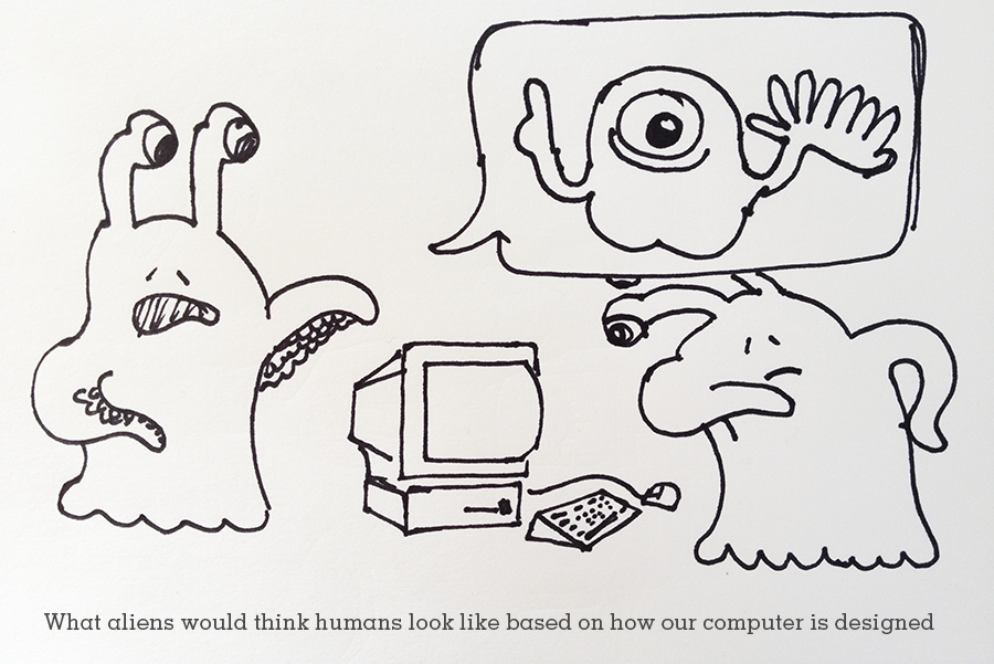
On the other side of things, the professor argued that this “languaging” of interaction creates a level of abstraction away from what our body inherently knows about an object. It takes it further from it’s context and its use. It might lock us into one perception of what and object is and can do. If we call something a chair, we are forever forced to think of it conventionally (what our learned patterns of interactions are with a chair) whereas it might have so many other possibilities. Or, things we don’t imagine to be chairs can be just as sitable. Design can have embodied knowledge by designing for the relationship between man and object/experiences. Chairs reflect certain needs that our body has: to bend at the knee, to have a flat surface a certain height from the ground and, for comfort, might have support for our backs—all working together to help the body rest. Compare this to poorly designed objects that might more function-driven rather than relationship driven. For instance, he described this cartoon of what an alien scientist might predict humans look like based on what our computers are designed like: A person with a hand that had one finger for clicking the mouse, a hand with like 84 keys to use the keyboard, one eye for staring at the screen, and just a giant bottom to sit on the floor while we used our device.
I couldn’t find the comic but I came up with my own version.


